“OASE is an independent, international, peer-reviewed journal for architecture that brings together academic discourse and the sensibilities of design practice. OASE advocates critical reflection in which the architectural project occupies a central position, yet is understood to be embedded in a wider cultural field. Intersections and affinities with other disciplines are explored in order to gain a more profound understanding of the practice and theory of architecture and rearticulate its disciplinary limits.” More.
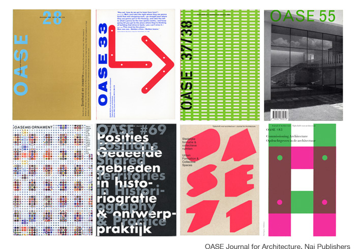
From 1990 (Issue 28) Karel Martens began art direction of OASE, often working with students from the Werkplaats Typografie. The success of OASE is due in large part to Karel Martens design, which reflects and transfigures his print and typographic experiments and develops a crucial formal dialogue between graphic design and architecture.
Each issue develops different typography and design. The only constant is the size of the publication. A restless typographic intelligence is at work throughout the sequence of issues, discovering new structures and arrangements and never settling on a single solution.
View issues as PDFs here.