Typography may have entered the stratosphere of a new age, but the internal dynamic that propels it remains the same, a fusion of language and the alphabet.
My Typographies

Typography may have entered the stratosphere of a new age, but the internal dynamic that propels it remains the same, a fusion of language and the alphabet.
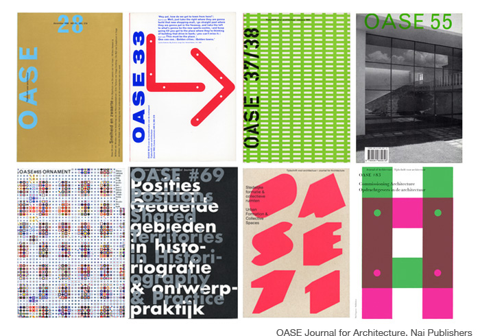
Each issue develops different typography and design. The only constant is the size of the publication.
For this assignment you will create a book in Indesign from the content of ten linked Wikipedia entries. Everyone will start from the same place: the Wikipedia entry for typography.
Since my “threadbare” and “reactionary” arguments may interest the readers of this magazine, I would like to present them here, without fear that they may “cause mischief”.
Find the Wikipedia entry for typography. Copy its HTML and link it to a CSS sheet in which you declare a value for every possible property of every HTML selector. Explore CSS as a means for the articulation of typographic hierarchy and the production of new visual forms.
It is worth considering once again the situation of typography.
This very short text is from Recollected Work, a retrospective of projects by the Dutch designers Mevis and van Deursen.
Standardization, instead of individualization. Cheap books, instead of private-press editions. Active literature, instead of passive leather bindings. (Jan Tschichold, 1930.)
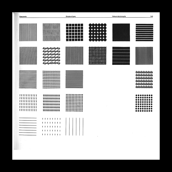
Shades of grey, Emil Ruder
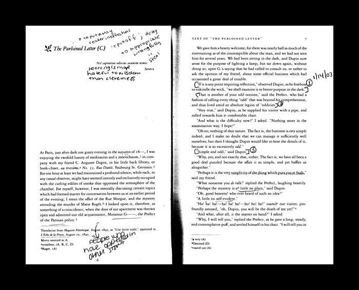
At Paris, just after dark one gusty evening in the autumn of 18—, I was
The invention of printing is manifested in works in which the new epoch-making process of using movable type does not show to its full advantage.
Editorial F.R. David, Winter 2008